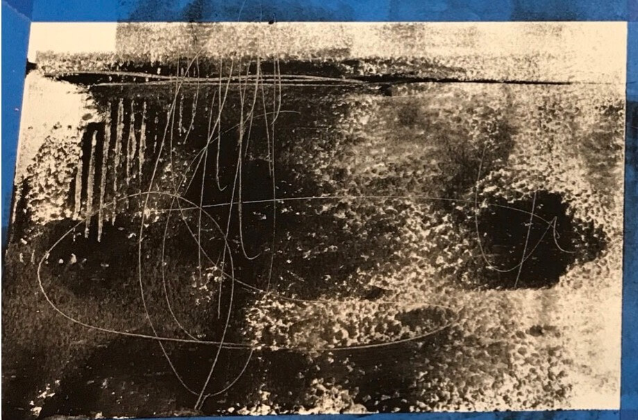
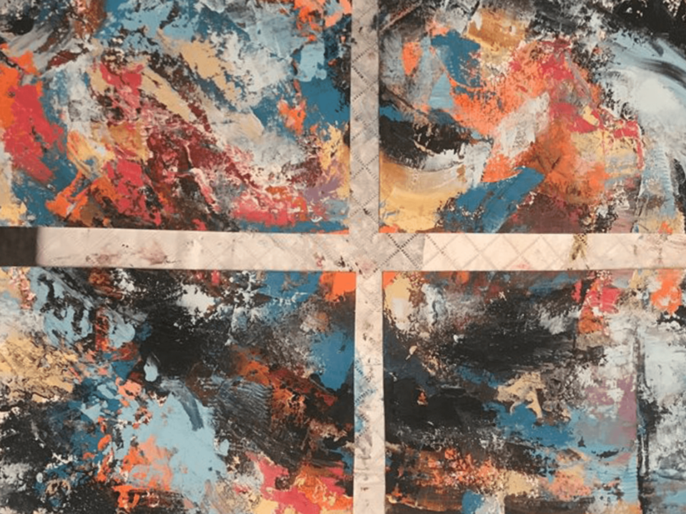
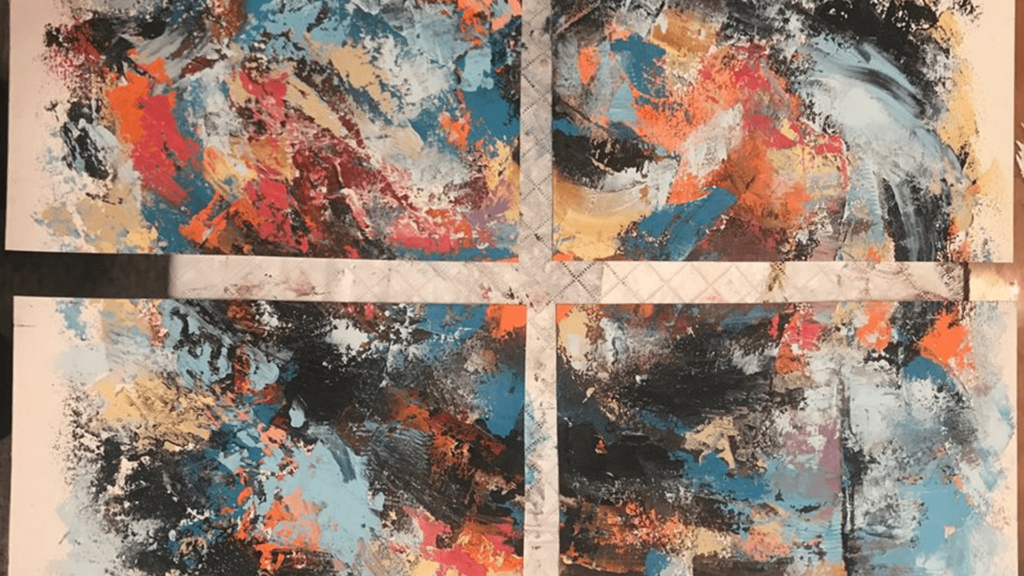
If you’re following my blog, you’ve probably seen many of these photos. Its how I start the majoirty of my oil and cold wax pieces, with a layer of black to set in some initial composition pieces as well as scratches and mark making for subsequent layers.
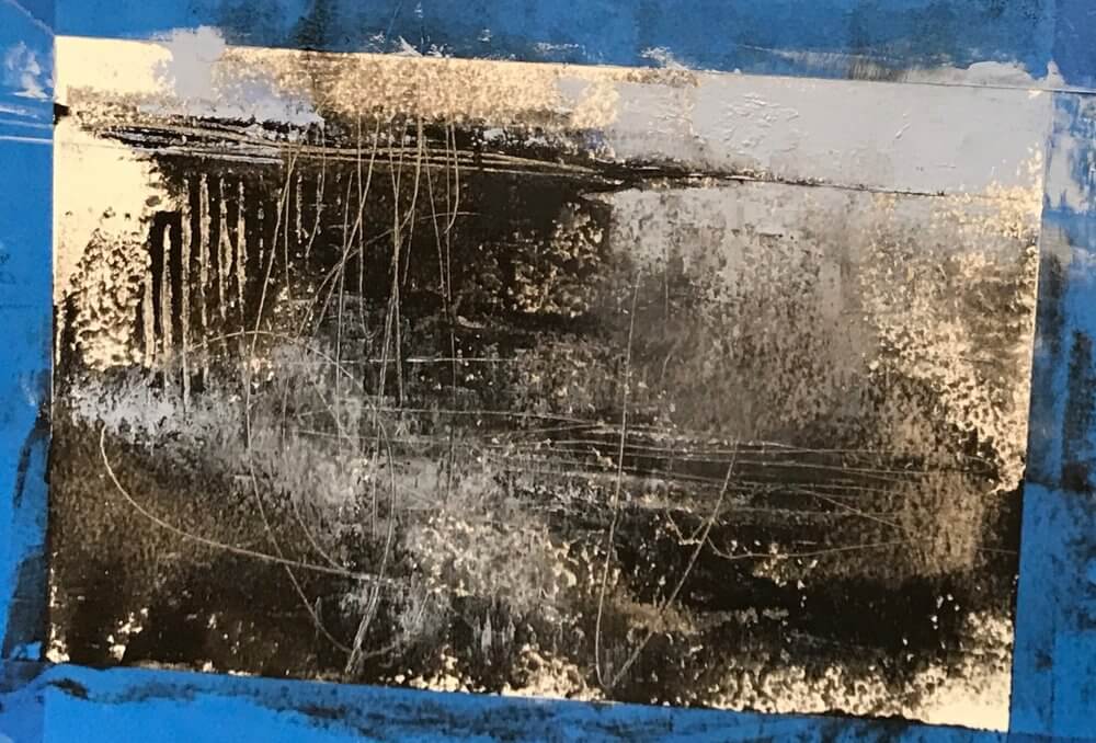
Again I follow the black with some very light blues. Using blue in landscapes is kind of a no brainer as it automatically makes one think of the sky. Thats a big reason I use it so much in these oil and cold wax pieces.
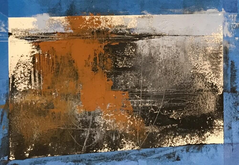
In another piece from this series I added a small piece of paper from an old book just to experiment with using cold wax as a adhesive, I thought that the brown of the paper looked nice with the blue that was already in the piece so I decided to add some more brown.
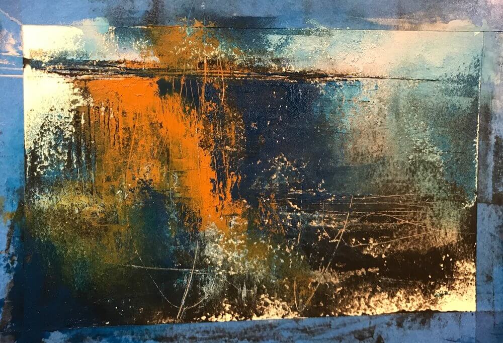
The dark blues came next, followed by the peachy-orange color on top of the brown. What I liked about this was that while some of the marks ended up being covered up with the thick paint, while other marks remained visible.
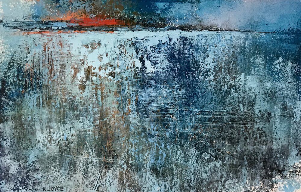
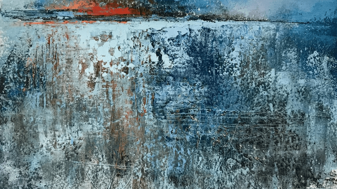
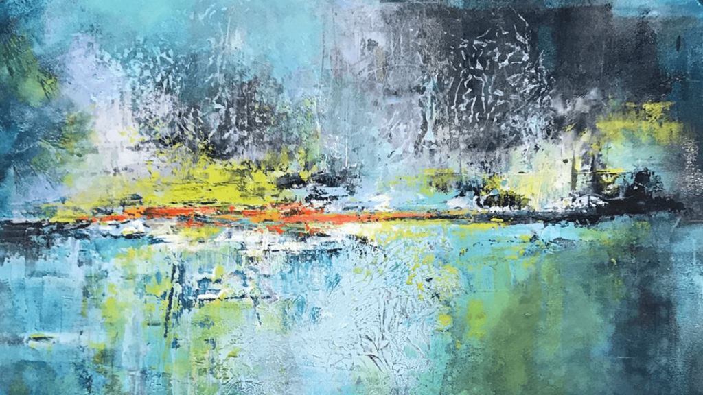
I sat with this painting in its second photo stage for quite some time and I really liked it and wasn’t sure what it needed next. I decided after finishing a few other pieces that maybe what it needed was some very light blue near the horizon and a thin layer throughout beneath the horizon. Then the finishing touch was the touch of red to create a bit more of a focal point.