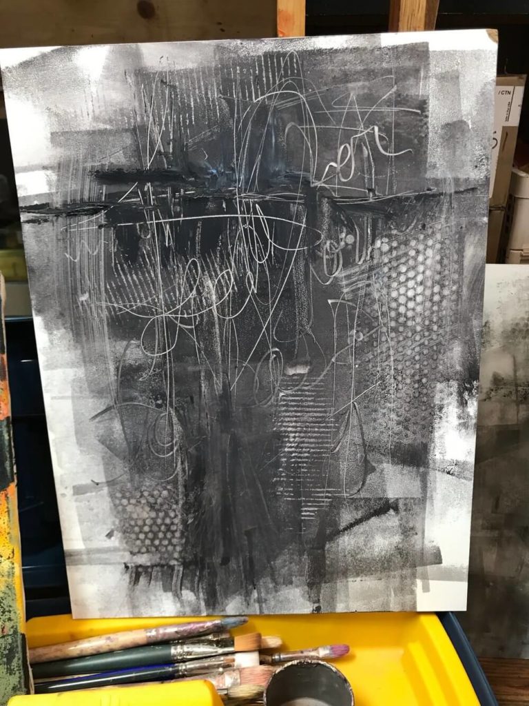
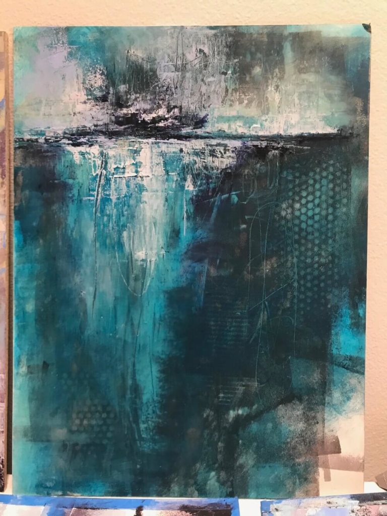
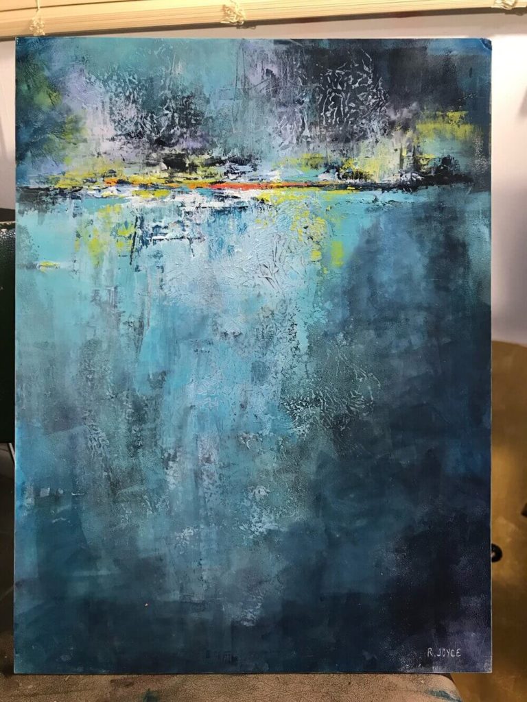
This painting started off as a total experiment. It was started during my second workshop with Mark Russell in 2017. I believe I only put two layers of paint on this piece at the workshop. The rest came over many years as this piece was in and out of storage. My goal at the time was to play around with different textures. I used bubble wrap to create the circles, the lines from the inside of a coffee sleeve to create the lines, and the back of my paint brushes to write words into the paint. I was attempting at first to not cover up the entire surface of the board with paint.
The good and bad thing about oil and cold wax is that sometimes things get easily covered up. I really liked a lot of the textures that were created but a lot of the writing ended up getting covered fairly early in the process. I still wanted to keep the other fun textures present in the painting.
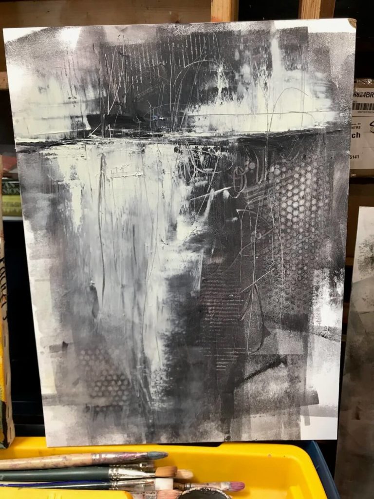
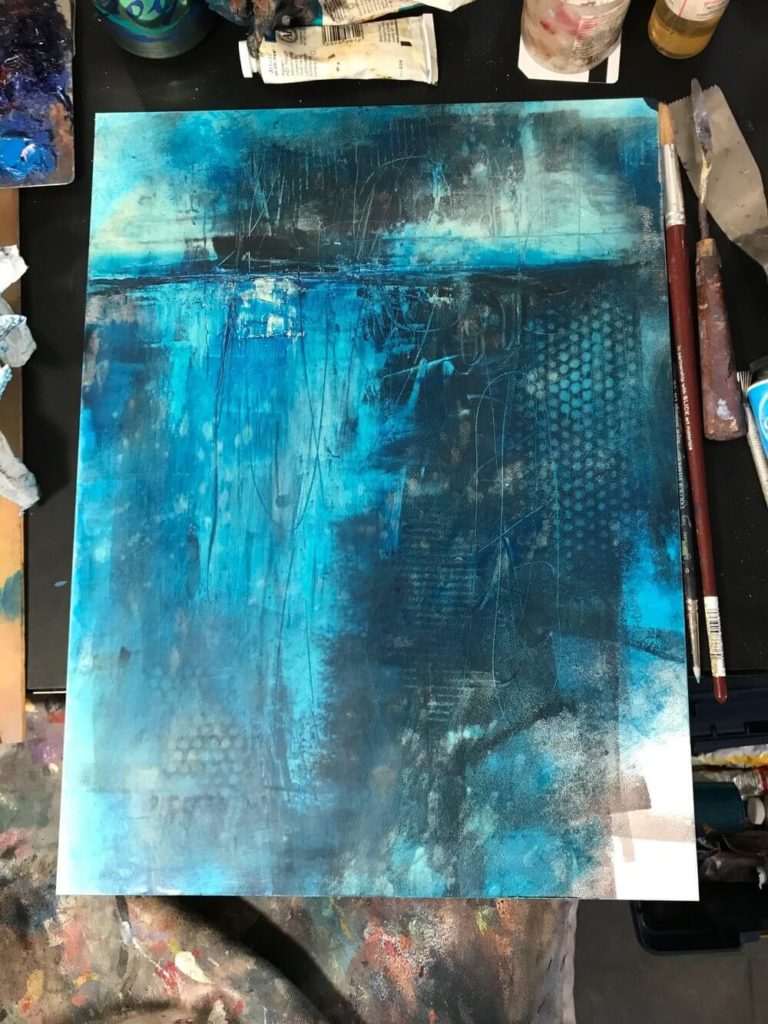
With this particular piece I didn’t have a real plan for what I wanted it to look like, I was really experimenting. The blue that I used at this stage, which I am struggling to remember what blue it was, ended up being totally transparent. I didn’t know it when I applied it but I ended up really loving how it looked. It sat like this for a good year before I picked it up again because I didn’t want to ruin it.
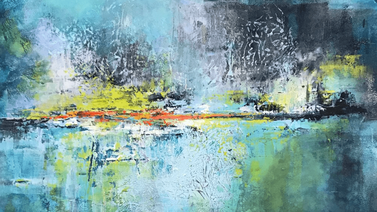
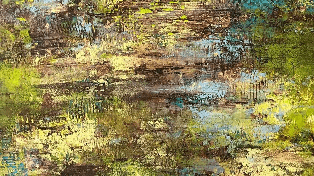
When I finally discovered this piece out of storage after quite some time I decided it was long overdue that I continue working on it. I just sort of went with what I knew and was used to doing with these abstract landscapes. The last value I had painted was on the darker side so I decided I needed to add more light areas. It ended up really highlighting the different textures happening near the horizon.
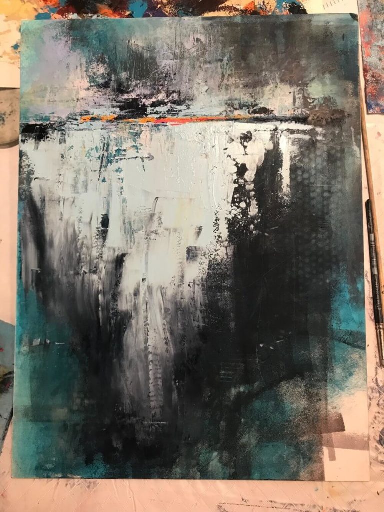
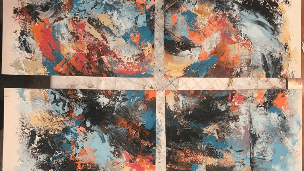
I got pretty bold with the light color and while I was really enjoying the top of the painting, the bottom felt forced and unnatural with the stark separation between the darks and lights. I realized that there was too much sameness throughout as well so I decided to add some orange, the compliment of all the blue happening in the painting.
I had applied pretty thick paint In the stage before and if I remember correctly I did this the same day as the previous photo. I took a wrinkled Jimmy Johns sandwich wrapper and laid it on top of the lower portion where the thick paint was, I then took my brayer and rolled it over the wrapper. This resulted in not only the wrinkled texture indenting the thick paint but also picking up some of that paint. I then picked up the wrapper and moved it around the piece to then stamp the same pattern to different areas of the painting. I just loved how it looked and actually did this to a few other pieces I was working on at the same time as this one.
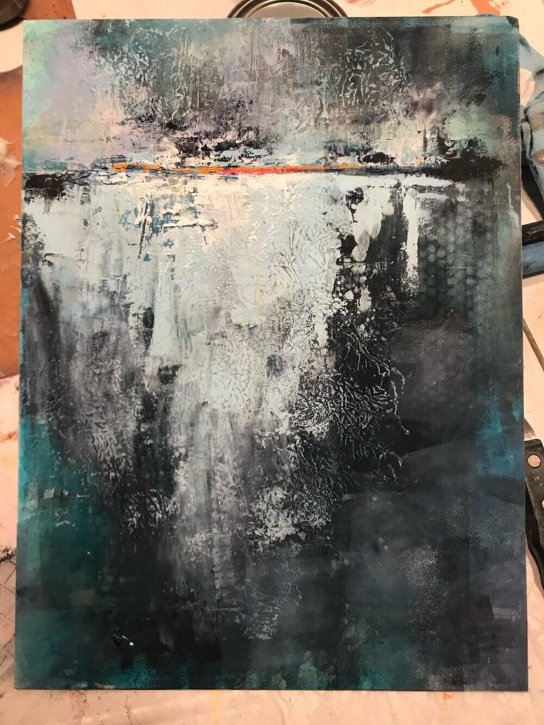
After some time looking at the painting I realized that it still needed something to tie the starkly different values together. I decided to use some of the same aqua/blue color I used in Trance to tie the darks and lights together. I did so very cautiously as to not over do anything and stopped before I did too much. Once again, at this point I set the piece aside because I was really liking it and wasn’t sure what to do next.
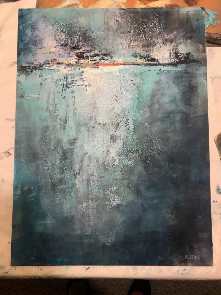
After a few months of not adding anything to this, I was scrolling through instagram and saw a very inspiring piece. One that didn’t look anything like this one compositionally but used very similar colors. That was how I decided to try adding the lime green color. I started with just a few splashes of it, just Incase it wasn’t working. However, I felt it worked really well.
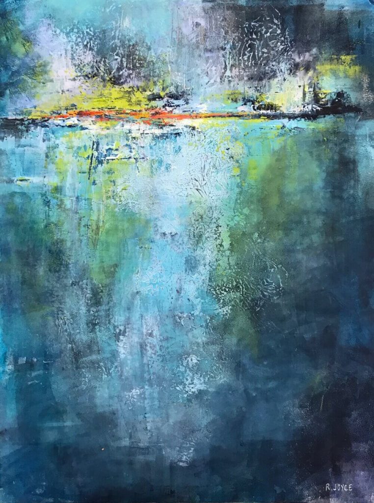
I added some more of the green, some areas brighter then others, and then added more of the orange and cadmium red light at the horizon.
Finally after years, this piece felt complete!!
